
K Ramen
A vibrant brand identity where Korean culture meets bold, modern design.
Services
Brand Identity,
Packaging, Label & Menu Card Design


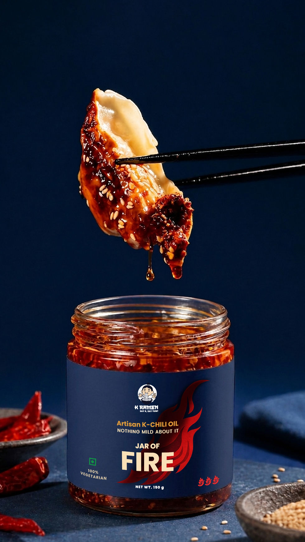
K Ramen brings the joy of authentic Korean flavors to life through design. The branding features a cheerful Korean character enjoying ramen, paired with a bold Korean-inspired typeface.
This playful yet contemporary style extends across the logo, packaging, and menu card, creating a consistent, lively dining identity.


Now open on NSR Road, Kuppakonam Pudur, Coimbatore

Design Process:
-
Cultural Exploration: Researched Korean visual motifs to capture authenticity with a modern edge.
-
Concept Creation: Illustrated a cheerful Korean character to embody warmth and joy.
-
Typography & Style: Designed bold, modern Korean-inspired lettering for strong recall.
-
Application: Applied the visual language seamlessly across packaging and menus for a unified brand experience.
All Projects


Designed with ♥ by Studio Iyarkai
© 2025 Studio Iyarkai . All rights reserved